Mistakes Were Made: Color Grading Cohesion (Here’s the Fix)
A field-tested, hands-on guide to achieving a single, honest look across a music video by planning color from day one through final delivery.
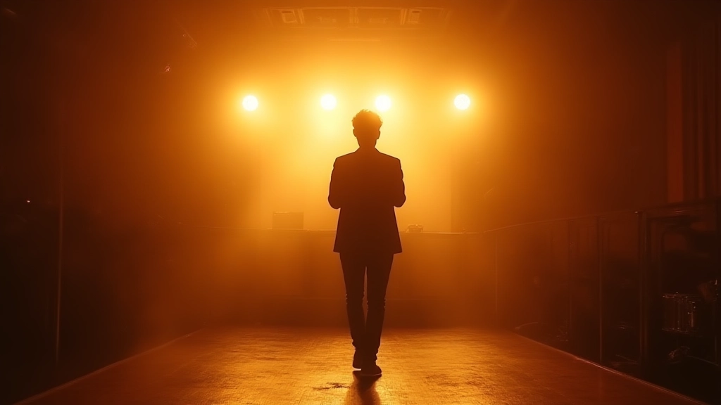
Vignette One — The Look Map: define the destination before you shoot
In the heat of a tour stop, you're staring at two monitors: your camera slate and the colorist's reference. The problem is not just color; it's an absence of shared vocabulary. Your first move is to draft a look map — a one-page color plan that translates mood into measurable parameters. Think in three levers: color temperature target, saturation ceiling, and contrast ambition. If the mood is warm and intimate, you might target a slightly warm 3200–3800K with desaturated skin tones and a gentle S-curve. If the mood is electric and nocturnal, push toward teal shadows and punchy highlights, but with a skin-presence guardrail so performers don't wash out.
- Create a 5-shot color bible that pairs each shot type with a numeric target (example: verse close-up, 2,900K; chorus crowd shot, 3,200K; bridge silhouette, 4,000K).
- Build a 3-color palette card you can pin to your production board: skin tones, mid-tones, and highlights. Name them and keep them consistent across takes.
- Export a quick LUT-free reference grade for the editorial suite so editors can align with your intent even before a single frame is graded.
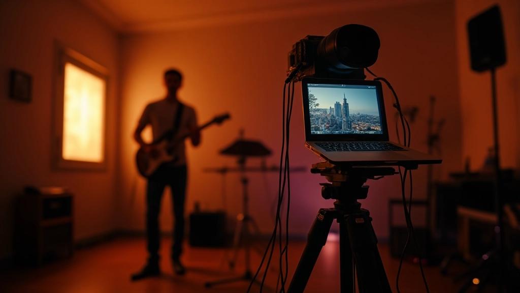
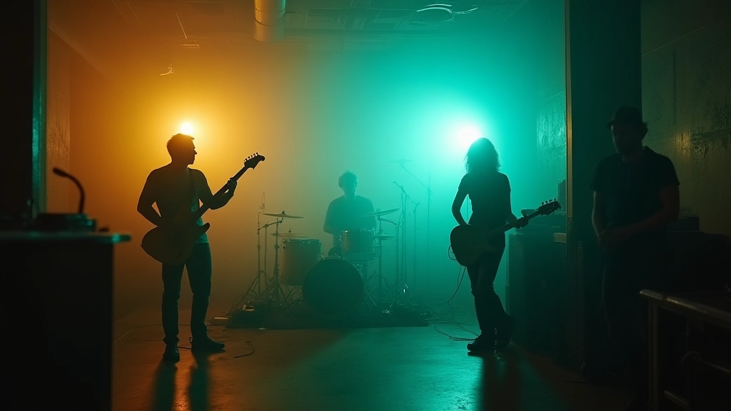
Vignette Two — On-set white balance and practicals: the lighting math you must master
The on-set color story begins with white balance. If every instrument in the room is telling a different temperature, you'll chase color all the way to the finish line. Start with a neutral base: a KT-3200K or 5600K baseline for consistency, then allow practicals to hint the look rather than define it. Use color-correcting gels sparingly and map their influence in your look map. On a loud venue night, you may accept a broader range of temperatures, but you must document it so color can dance within a defined boundary, not wander aimlessly.
- Set a camera WB target that matches your look map; lock it across cameras if you shoot with more than one unit.
- Record a 10-second white-balance test plate at the start of each setup change; mark the plate in post with your chosen reference so editors have a concrete baseline.
- Note how each practical light adds a tint; tag these in your look map as "influences" rather than as final color decisions.
Vignette Three — The color script: pre-shot planning that keeps your look honest
A color script is not a grading cheat sheet; it's the narrative spine of your color language. Sketch a color arc for the entire music video that mirrors emotional crescendos — early scenes might use a restrained palette, mid-chorus moments can push saturation, and the final refrain could return to a refined, cohesive glow. This script should translate to concrete steps for the colorist: a primary grade pass, a skin-tone check, a texture pass for skin and fabric, and a highlight roll-off plan.
To make this actionable, pair each scene with a color intent card: {look name, target temperature, saturation cap, contrast preference, and a notes field for special cases like red wardrobes or neon signs.} You can create these in a shared doc or a PDF that travels with the edit timeline.
- Primary grade target: a neutral baseline that preserves natural skin tones
- Secondary color: the color that defines the mood (teal shadows, amber glow, etc.)
- Edge cases: keep track of scenes with heavy backlighting or reflective surfaces
Vignette Four — The post pipeline: from first grade to a cohesive finish
In post, the goal is not to toggle a single dial but to manage a sequence of graded decisions that build a single language. Start with a 2-pass workflow: (1) global primary grade across the entire timeline; (2) targeted corrections in problem areas such as lip colors, eyes, and confetti of reflective surfaces. A common pitfall is letting a fast cut erase the narrative color arc instead of reinforcing it. Your first pass should unify exposure, color temperature, and saturation across all shots at a base level. The second pass should refine skin tones and preserve the intended palette in key moments like the chorus and climactic bridge.
| Approach | Strength | When to Use |
|---|---|---|
| Global Primary Grade | Consistency across shots | All scenes |
| Secondary Color Pass | Mood definition | Key moments |
| Skin Tone Guard | Authenticity | All close-ups |
If you're using LUTs, keep them subtle. The goal is not to apply a dramatic filter but to encode your color vocabulary into the grade so editors can ship a single look, frame after frame, in the final cut.
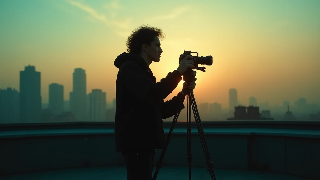
Vignette Five — The on-set color rigor: shooting with future in mind
Here is where pre-production and on-set discipline pays off in the edit bay. Rehearsals should run through the palette while you test wardrobe choices. Have the DP and the colorist walk the set with the same color script, ensuring the entire crew understands where the grimy teal becomes a chorus glow and where the warm tungsten should settle into a gentle, cinematic skin tone. On set, capture color-referenced stills every so often and label them by scene and take so you can trace back to the exact lighting and camera settings during post.
- Shoot two or three takes with the look map in mind so you have redundancy for color decisions
- Label wardrobe and prop colors that might shift temperature (e.g., bright red guitar, reflective cymbals)
- Log rough grade notes on set for quick cross-checks in post
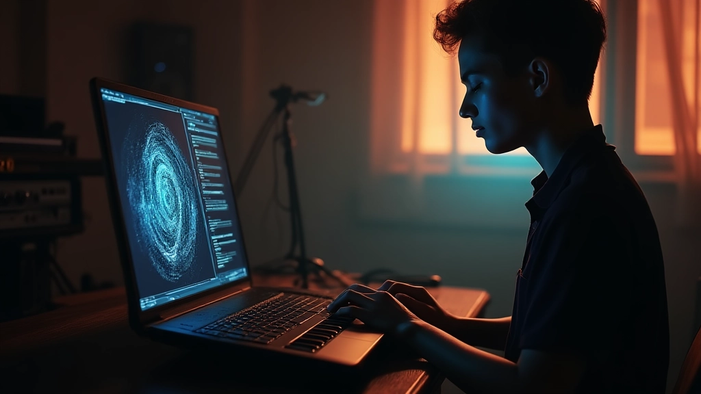
Vignette Six — AI and color: tools that assist, not replace your eye
Artificial intelligence can speed up color matching across takes and help you test alternative looks quickly. Treat AI as a collaborative assistant: (a) run a batch-matched grade across a selection of takes to test how your look holds up under different lighting, (b) generate alternative color harmonies for mood experimentation, and (c) use AI-driven skin-tone analyzers to flag out-of-range hues. But always verify results with human judgment, especially for skin tones, which respond best to careful, nuanced adjustments. If you're exploring LUT packs, Moozix offers a compact, artist-tested library that can seed your base grade without dictating it. The point is to keep your eye in the loop.
"A consistent look is less about the cleverest curve and more about disciplined checks that travel with every shot."
Director of photography, colorist collaboration
Vignette Seven — Review, refine, release: a color cohesion checklist you can reuse
As you wrap, run a final cohesion check that you can reuse on future projects. The checklist below is designed to be a one-page document you place in your editor, your colorist's notes, and your director's shot list. It ensures every scene reads with the same palette and tonal balance, from first frame to end credits.
- Is skin tone within the target range across all key moments?
- Do all scenes adhere to the established color temperature targets?
- Are saturations capped to preserve detail in highlights and shadows?
- Do backlit or high-gloss surfaces reflect your look without creating color halos?
- Have you tested the grade on the intended delivery codecs (Web, streaming, cinema)?
- Is there a clearly documented color bible for future reference?
"Cohesion is not a single filter; it's a conversation between light, color, and time across every frame."
Hear what these choices do to your own song.
Upload stems or a finished track, choose a reference direction, and compare a private Moozix mix before you export anything.