Notes From the Road: Visual Branding for Indie Music Videos
A rooftop at golden hour, a mood board pinned to a fridge, and a camera that feels like an instrument. This is how a musician builds a visual identity that travels with their music from small rooms to big stages, and through the endless scroll of social feeds.
Visual branding for music videos isn’t about slapping a logo on the corner of a frame or chasing every latest effect. It’s about curating a consistent mood, a language of images, and a narrative thread that carries your music from venue to venue and into fans’ feeds with minimal friction. In this piece, I walk you through a practical system you can apply whether you are touring with a six-piece band, recording in a home studio, or releasing a DIY single from a closet studio. You’ll see how real artists build an identifiable look, how AI can extend your creative reach without erasing your voice, and how to turn a shoot day into a stepping stone for ongoing visual storytelling.
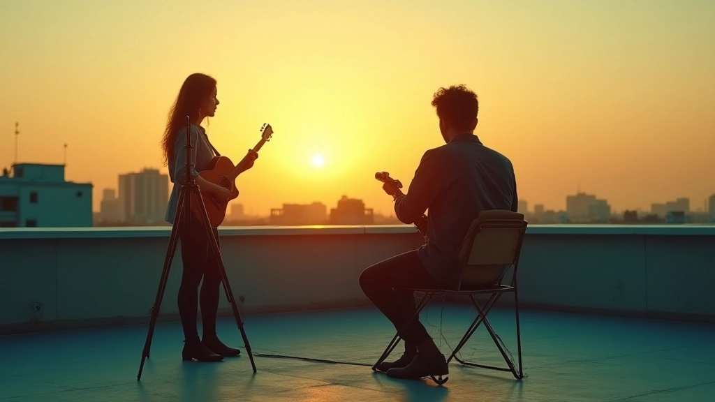
Before we dive in, a quick scene: on a recent rooftop shoot with a rising singer named Mira, we started by defining the mood in three words, then built a color palette, shot list, and editing rhythm that could travel to a club stage or a bedroom livestream. The result wasn’t a single gimmick; it was a system that kept Mira’s story consistent even as the visuals shifted with the setting. This is the essence of branding for indie music videos: a flexible framework that honors your art while embracing smart production choices and a dash of AI-assisted experimentation when it serves the song.
What you will find here is a field-tested approach with accessible steps, short case stories, and concrete tools you can adopt this month. It’s written for every creator on the spectrum from the touring artist to the bedroom producer who wants to tell bigger stories visually without getting stuck in a single method. And yes, AI is part of the conversation, but not as a silver bullet. It’s a collaborator that helps you explore new textures, fine-tune color ideas, and speed up repetitive tasks so you can focus on the human moment in front of the camera.
Branding is the path your audience follows through every frame, not a sign on the wall.
Now, let’s translate that idea into something you can apply in your next video project. We’ll move from a high-level principle to actionable steps, then to micro-stories that illustrate how the framework plays out in practice. Along the way, you’ll find a compact toolkit you can assemble on a budget, plus a practical workflow that you can start using today.
Rethinking branding: more mood than mark
When artists talk about branding, most minds jump to logos and merch. In the context of music videos, branding is really three intertwined things: the visual mood that pervades color and lighting, the directing language that governs camera movement and shot design, and the story language that ties imagery to the song’s arc. You may not realize it, but every successful indie video you respect has a remarkably consistent set of choices that feels inevitable once you notice it. The mood is consistent, the camera language remains recognizable, and the editing cadence echoes the song structure. That consistency is branding in action, and it travels with the music long after the video is posted.
Let me share a quick mini-story to anchor this idea. Mira, a singer-songwriter with a growing following, started with a guitar-and-lamp-room look: closeups, warm tungsten, a slightly dim stage vibe. After a few shoots, we pressed the brakes on chasing a trend and asked a simple question: what story does your visuals tell about the song itself? The result wasn’t a new filter or a new lens; it was a decision to shoot on a single color family for a whole EP cycle, then to port that same mood into live sets, lyric videos, and Instagram reels. The payoff wasn’t just a more cohesive set of visuals, but a faster post pipeline and a stronger fan connection, because the visuals began to feel like an extension of the music rather than a tangential ornament.
The branding pyramid: identity, language, workflow
Think of your visual branding as a pyramid with three layers. The base is identity (the core vibe you want fans to feel). The middle is visual language (the vocabulary of images: color palettes, textures, camera angles, typography, and graphics). The top is workflow (how you implement decisions on set and in post so the creative idea can travel across formats consistently). When these layers are aligned, you get a brand that is not perfectly uniform, but clearly recognizable regardless of location, cast, or gear.
Identity is not a single element; it is a living set of constraints and freedoms you give yourself. For Mira, it was an ambient warmth with a hint of nocturnal blue. For Lena, a bedroom producer, it became a tactile, analog-inspired texture language with rough edges to emphasize spontaneity. For Jax, a touring artist, it meant crisp, high-energy framing and a consistent drumbeat in the video cadence that matched the live show energy. The middle layer, visual language, translates that identity into concrete cues: a limited color palette (three primaries plus neutrals), a couple of signature camera moves (a glide pan on chorus, a tight handheld during bridge), and a graphic system (lower thirds and title cards that share a consistent typographic rhythm). The top layer, workflow, ensures these choices survive the chaos of different shoots. A shared shot list, a color pipeline, and a template editing project are the glue that keeps every future video true to the brand even if the crew changes.
To illustrate, consider a practical mini-workflow that any indie artist can adopt. It begins with a one-page brand brief that answers these prompts: What is the song’s emotional core? What three visual moods does it inhabit? What is the simplest set of camera moves that communicates the mood? Then, you translate those answers into a moodboard, a color script, and a shot list. The color script is the guide you show to your DP, even if you are working alone with a smartphone. The result is a video that feels inevitable, not accidental.
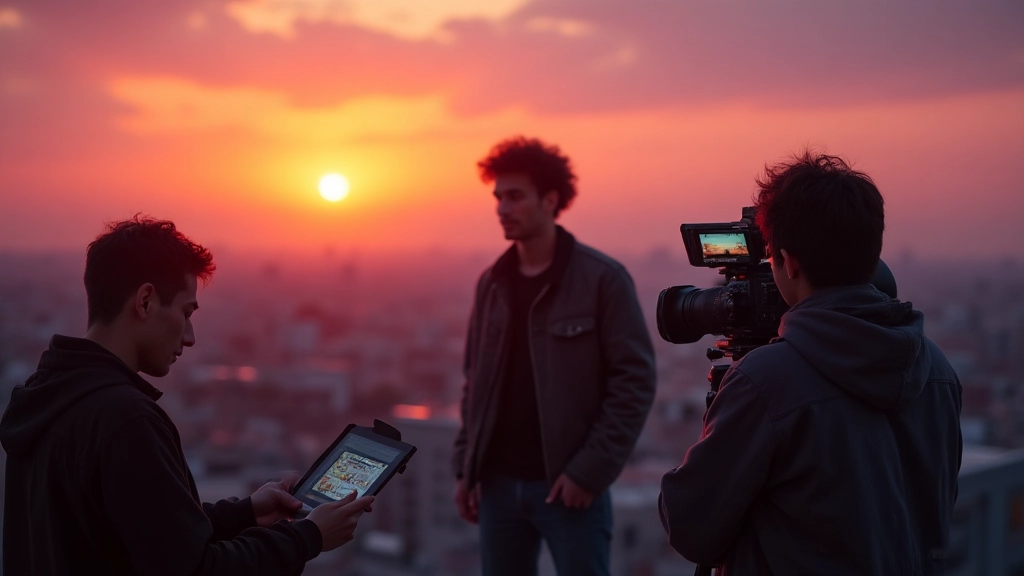
Case study in three scenes: building a visual identity with AI as a partner
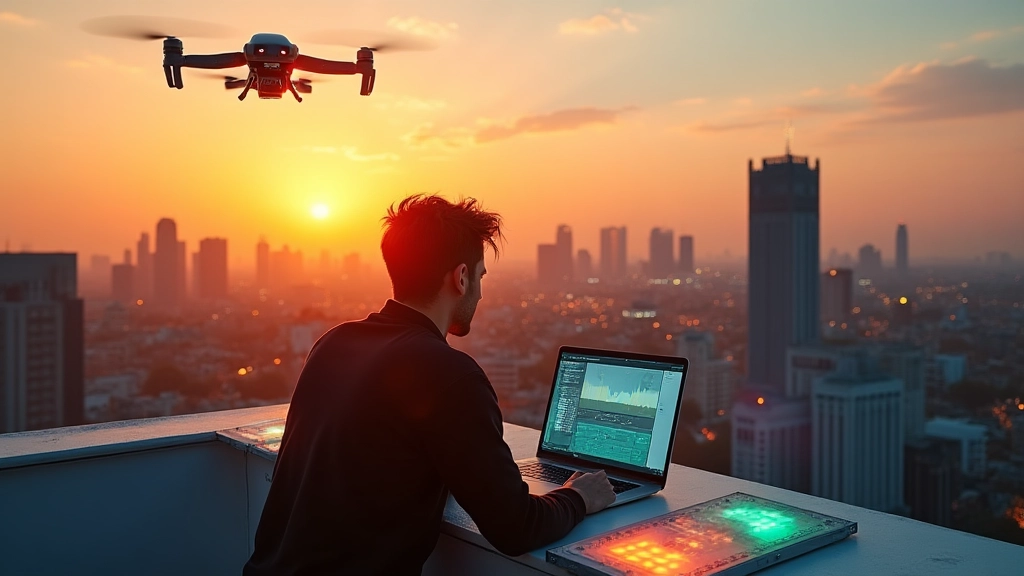
Let me introduce Maya, a touring guitarist who writes songs in a small apartment and plays clubs where the lighting budget is modest and the time window tight. Maya uses AI tools not to replace her instincts but to expand her palette. She begins with a moodboard built in a collaborative app, pulling in color swatches, texture references, and lighting notes. Then she uses an AI-assisted tool to generate a few stable, non-greedy texture backgrounds and motion patterns that can be layered behind her performance. The process helps her visualize color interactions before she commits to locations and gear.
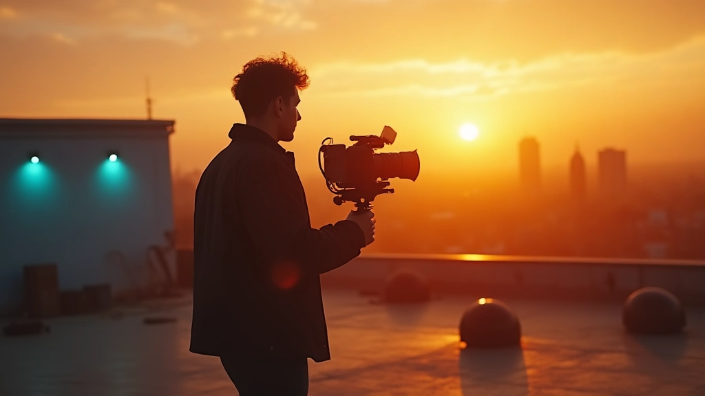
Scene 1: The rooftop idea. On the edge of a city rooftop, Maya improvises a performance as sun sinks behind glass towers. The AI-generated textures suggest a set of grainy, ember-toned overlays that mirror the warmth of her guitar tone. We keep the camera at eye level to invite the viewer into the moment, letting the textures drift across the frame with her movements. This stage becomes the visual identity anchor: a subtle dusk palette, gentle motion, and a sense of improvisation as a throughline.
Scene 2: The rehearsal room moodboard. Back in the home studio, Maya curates a moodboard that combines real-world gear and abstract textures: a lamp, a painted wall, a strip of neon, and a tactile fabric. The AI tool helps brainstorm lighting ideas by simulating how a warm key light interacts with a blue fill, producing a color grading target that is both cinematic and attainable in a small space. The result is a look that says ‘we are a real band on the edge of breaking through.’
Scene 3: The club night test. In a mid-size club, Maya tests the color palette in a live environment. The AI-assisted suggestions help fine tune contrasts and highlight choices so that the visuals remain legible on a phone screen yet compelling on a projector. The takeaway is not about gimmicks; it is about maintaining a consistent mood under real-world constraints.
Three practical, budget-friendly shooting formulas
You don’t need an expensive production to begin building a strong visual brand. These three templates let you scale from bedroom sessions to small venue shoots while preserving your brand language.
- Domestic warmth template: a cozy room or kitchen with practical lighting, a single actor, and a minimal crew. Focus on texture, selective color accents (a red scarf, a teal mug), and intimate framing. Use a fixed camera or a couple of simple moves to keep the mood steady. This is perfect for acoustic tracks or intimate storytelling songs.
- Rooftop or street aesthetic: urban textures, real-world light, and a dynamic host who moves with the city. Combine natural light with a controllable LED accent to sculpt the scene. This setup works for upbeat songs and festival-ready visuals where time is a premium but the vibe must feel expansive.
- Club-ready performance: a small stage, practical lighting rigs, and a performance silhouette. The emphasis is on rhythm and timing, with quick cuts that align to the music. A consistent color wash and a reliable camera language help the performance land with impact in both live and streaming contexts.
Each template is intentionally simple. The goal is not to chase spectacle but to preserve the consistency of your visual language across contexts. You can begin with a single template for an entire release cycle and mix in elements from the others as needed. The brand remains, even if the location and gear vary.
From concept to cut: a practical seven-step workflow
- Define the narrative intent – What feeling should the video induce, and where does the story arc start and end? Write a one-paragraph brief that your entire team can reference.
- Choose the color story – Pick three primary colors and two neutrals that will tie all visuals together. Create a color script with swatches and rough LUTs that you can reuse across shoots.
- Build a concise moodboard – Include textures, lighting references, wardrobe cues, and camera language. Share it with your crew so everyone is aligned.
- Plan shot language – Decide on a handful of signature moves (a glide shot, a tight handheld moment, a low-angle performance) and map them to sections of the song.
- Prepare a lightweight production template – A one-page shot list, a gear checklist, and a color-corrected timeline template help you move fast on set.
- Shoot with intent – On set, keep your mood in mind. If a take doesn’t feel like the brand, adjust lighting, framing, or tempo. Small changes compound into a stronger look over multiple takes.
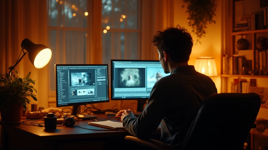
- Edit with a consistent rhythm – Maintain editing cadence that mirrors the song: slower sections breathe, high-energy parts snap, and transitions feel seamless. Use LUTs and an editing template to preserve your brand language across cuts.
AI as a collaborator, not a crutch
AI can be a powerful partner in branding your music videos when used intentionally. It can generate texture ideas, simulate lighting scenarios, and prototype variations of a scene faster than you can sketch them by hand. The key is to keep your voice front and center. AI outputs should be treated as texture and experimentation rather than final decisions. Here are three practical ways indie artists have used AI in branding their videos:
- Color texture experiments: Use AI to explore atmospheric overlays that sit under your performance color, then pick the options that enhance mood without overpowering your vocal or instrumental tone.
- Backgrounds and overlays: Generate subtle moving textures or abstract backgrounds to layer behind performers in static shots, creating depth without expensive sets.
- Guardrails: Establish limits so AI does not drift into a look that distracts from the song. Decide early where it enhances and where it would dilute the brand.
In Mira’s setup, AI helped test color interactions and texture possibilities in advance, which meant the shoot day focused on performance and story rather than chasing a single perfect look. That shift from improvisation to intention is where branding becomes scalable for any artist, anywhere.
Toolkit essentials: gear, software, and cheap wins
Branding does not require a big budget if you are smart about the choices you make. Here is a compact, practical toolkit for indie artists and bedroom producers:
- Color and mood: a color palette cheat sheet (three primary colors, two neutrals) and a simple LUT set
- Lighting: a small LED panel or two, plus a practical lamp for warm accents
- Camera language: a light stabilizer for smooth moves, a compact prime lens for shallow depth of field
- Post pipeline: a reusable editing project template with preset color grades and lower-thirds
- AI aids: texture overlays, motion pattern generators, and preview renderings to test concepts quickly
- Wardrobe and set: a few versatile pieces and props that can be mixed to suggest mood without a full build
Three quick budget wins: borrow a friend’s lighting kit for a weekend; shoot a multi-song day in a single room to minimize gear changes; and repurpose a home decor setup as a scenic backdrop to create a distinct atmosphere without constructing full sets.
Three concrete mini-stories you can remix
Story A: A bedroom producer builds a live-city look in a single room. With a few LED strips and a lamp, the artist crafts a color wave that matches the chorus. The AI tool suggests background textures that resemble neon reflections on glass. The result is a video that feels cinematic and intimate at once, perfect for streaming and social clips. Story B: A touring artist uses a club lighting rig to create a four-location narrative across a single performance. The mood remains consistently warm, but the frame rate and editing rhythm shift to match the energy of the track. Story C: A duo releases a lyric video that doubles as a visual short film. They maintain a tight color palette and a repeating motif that becomes an audible cue in the chorus. Viewers begin to associate the motif with the artist, not just the song.
Common pitfalls and how to avoid them
- Over-styling: When every shot looks like a repaint, the audience cannot sense the song’s natural movement. Stick to a restrained color palette and let performance lead.
- Brand drift: If the look changes drastically between videos without a clear throughline, fans may lose the sense of who you are. Map new visuals back to the core mood you defined at the start of the cycle.
- Inconsistent audio-visual rhythm: Visuals should feel like they are talking to the music. If the frame rate or cut pace does not align with the song, the video can feel disjointed.
Each pitfall has a simple fix: re-anchor yourself to the mood, reuse a color script, and test edits with a quick audience check-in (even a note on the back of a napkin in your rehearsal space can help you see what fans might feel when they watch the video alone on a phone at 2x speed).
Closing notes: brand as an ongoing practice
The most enduring branding comes from daily practice, not a single shoot day. Treat your visual identity as an evolving system that grows with your music. Begin with a one-page brief, then build a living moodboard and a lightweight editing template that you can reuse across releases. Practice means failing forward: test new ideas in small, low-stakes projects such as lyric videos or social shorts before you commit to a full-length video. Each experiment teaches you what works for your audience and where your storytelling should head next.
As you move forward, ask yourself three questions before every shoot: What moment does this shot capture about the song? Which color in my palette amplifies that moment? Does this camera move serve the emotion or distract from it? If you can answer those questions clearly, you are already halfway to a brand that fans recognize with your first note and remember long after the final frame.
In this era, AI can help you expand what is possible while preserving your authentic voice. Use it to test ideas, not to replace the human touch. The best music videos feel like a conversation between music and imagery, and your visual branding is the host that welcomes the audience into that conversation year after year. Now it is your turn to take the stage, with a clear mood, a language that travels, and a workflow that makes the process feel like writing a song you already know by heart.
Ready to start? Gather three images that capture your mood, sketch a color path, and write a one-page brief for your next video. Then shoot a micro-version of your concept in a single room. If you can pull that off with conviction, the road ahead will feel less uncertain and more full of opportunity.
And should you want to extend these ideas, consider documenting your process in a short behind-the-scenes video that fans can relate to. Sharing the journey as you refine brand language reinforces trust and invites fans to participate in the growth of your visual identity. The road may be long, but every frame you shoot adds another mile to your brand story, and that story belongs to you.
Hear what these choices do to your own song.
Upload stems or a finished track, choose a reference direction, and compare a private Moozix mix before you export anything.