A field guide to visual branding for AI-infused music videos told through the lived moments of a composite artist on the brink of a breakthrough. No hype, just practice you can push into your next shoot today.
The room hums with the soft whirr of a fan and the distant clack of a keyboard. A single color swatch sits on the table, its edges worn from years of storytelling. Tonight, the palette will finally speak in three words: ember, crystal, shadow.
1) The Visual Brand Blueprint: Three words, one look
Brand visuals that endure start with a promise you can defend with sight, sound, and motion. Nova Reed, a composite artist who blends indie pop with experimental visuals, begins by crystallizing three adjectives that capture the emotional engine of the song. For her, it is crystal (clarity and precision), ember (heat, human warmth), and shadow (mystery, depth). These words become the north star for every frame, every color decision, every prop choice. Here is how to translate a mood board into a shoot plan you can actually execute.
- Define three adjectives that map directly to the listening experience of the track. Write them as a single sentence you can recite on set.
- Choose a three-color palette that supports those adjectives and test it against skin tones, flags, and textures found on location.
- Draft a one-page visual bible: fonts, logo treatment (even if you won't use a logo), textures, and a recurring motif (shape, line, or camera movement).
- Record a 30-second shot-on-video reel that illustrates each adjective with a simple storyboard block (one shot per adjective).
- Commit to a single visual motif (a shape, a gesture, a lighting cue) that you will repeat across at least five scenes.
Two mini-stories from the field illustrate the approach. In the first, Nova rents a small studio and brings only a light kit, a projector, and a handful of textured fabrics. The palette becomes the conversation: amber for ember, icy white for crystal, charcoal for shadow. In the second, a touring musician uses a hotel room as a last-minute set and discovers that a simple table lamp, a white bed sheet, and a smartphone are enough to hint at the same three-word mood.
2) Storyboarding the AI-assisted video: map beats to visuals
AI visuals can be a partner, not a replacement. The storyboard becomes a living contract with the machine: a plan that guides AI generation while preserving your artistic voice. Nova uses a simple method: for each verse, chorus, and bridge she writes a short visual sentence that captures the mood and a concrete action that can be shot on set or simulated on a laptop. This keeps the creativity human and the process repeatable.
Step-by-step storyboard (7 steps)
- Break the track into 4 acts: intro, verse 1, chorus, verse 2/bridge, final chorus.
- Assign a mood for each act (e.g., intro = quiet ember; chorus = crystal surge; bridge = shadow drift).
- Write one sentence per act that describes a key image (not a shot list yet).
- Pair each sentence with a practical on-set action (e.g., a color card flick to reveal palette, a projector bloom, a close-up of hands drawing lines).
- Define a motion language: a single camera move (push in, slide, or tilt) that appears in at least two acts to create cohesion.
- Draft a 8-frame lookbook: color, lighting, texture, and a provisional LUT or grade target.
- Spin a 60-second test on a laptop using stock video that echoes your mood sentences; iterate quickly.
On set, a practical trick is to translate mood into a live color ramp. If ember is your anchor, you might start with warm tungsten and gradually layer in amber gels, letting the projector act as a third color. If you are working with a low-budget shoot, you can simulate the look with practical lamps and a single cutaway shot using a smartphone to map the color shifts before you commit to lighting changes.
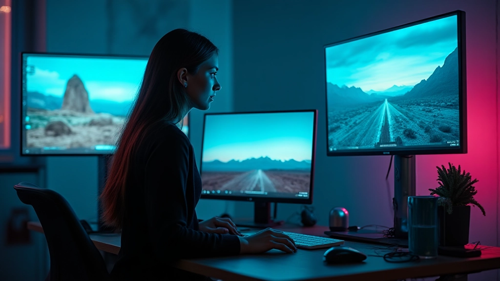
3) Tools, workflow, and brand alignment
A coherent visual brand is not a single tool; it is a workflow that weaves color science, practical lighting, and AI-assisted creation into a single thread. This section is a field-tested playbook you can adapt when you have a band, a budget, and a deadline. We will ground the discussion with a real-world workflow that Nova used across three projects, including a collaboration with a small indie ensemble and a solo project with a neon city backdrop.
- Asset alignment: Before any shoot, assemble a living style sheet: color swatches, texture samples, font moods, and a visual motif. Align this with three adjectives and your mood board.
- Lighting language: Create a lighting plan that can be replicated with practicals. For example, a three-light setup that can subtend the ember and shadow mood while offering enough contrast for color grading.
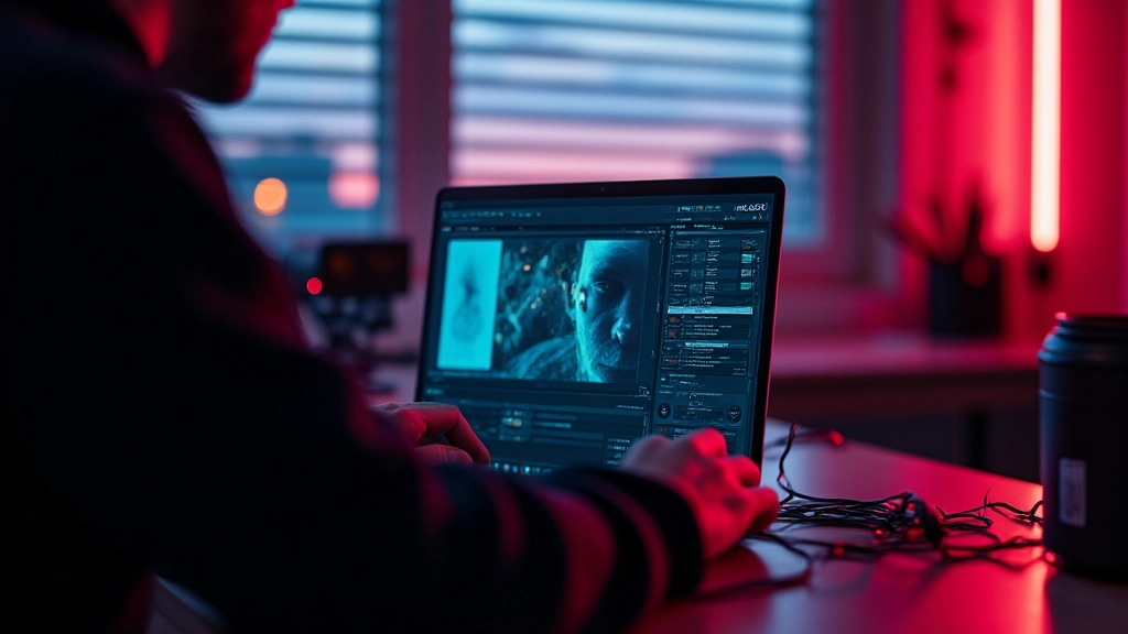
- AI-friendly pipeline: Set rules for generative visuals that preserve your color palette. Keep the base look consistent and use generative elements as overlays rather than the main frame.
- On-set roles: The director, the DP, and a visual editor should hold brief daily notes that capture color decisions, camera moves, and any AI prompts or prompts-like instructions used in post.
- Reshoots and backups: Anticipate five backup shots for every location and create a quick shot list to cover any sudden changes in lighting or weather.
Two quick field scenarios illustrate the workflow. In Scenario A, Nova shoots a four-song set in a warehouse. The color palette is grounded: bronze, teal, and slate. The AI visuals loop a crystalline motif that mirrors the singer's gloved hand drawing shapes in the air. Every frame moves with the tempo, and the team references the style sheet at every lunch break. In Scenario B, a rooftop session uses neon signage as the visual anchor. The sign red becomes a dynamic highlight color; the AI-generated shapes drift in time with the chorus, but the base palette remains anchored in ember and shadow. Across both stories, the branding is tactile, not digital wallpaper.
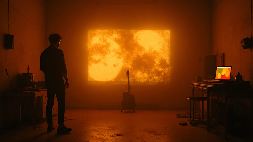
4) Lighting and set design on a budget that still looks expensive
Budget constraints force you to be clever, not cheap. Nova demonstrates that your visuals can be robust with a few well-chosen elements. The trick is to build a believable world with three layers: the practical lighting you can control, the ambient light you can't, and the texture you can feel through the screen. Think of the room as a stage where every color, surface, and movement can tell part of the story.
Budget-friendly lighting plan
- 1 key light with a warm gel, a second backlight to create a halo, and a practical like a desk lamp for color accents
- Quantize shadows: keep 60% of the frame in shadow to preserve depth and drama
- Use a black foam board to sculpt light and to push contrast
Texture matters. A rough rug, a metal grid, and a glass sheet can refract light in unpredictable, visually rich ways that AI visuals can echo when layered in post. On rooftop shoots, geometric shadows from a railing or a window frame can become a repeating motif that anchors the video even as the AI overlays drift in and out of the frame.
5) Post-production rhythm: color discipline and cut tempo
Editing is a storytelling tool as much as a technical task. A strong visual identity becomes a verbal one when the editor uses the palette as a beat guide. Nova uses a two-pass approach: a rough cut where timing is choreographed to the track, and a polish pass where color and texture are treated as musical phrasing. The goal is to keep the viewer in a continuous sensory loop, not to overwhelm with flashy tricks.
- Sync and timing: Align your first cut with the track's emotional peaks. Reserve 3 moments per act for a visual micro-gesture that reinforces the mood.
- Color as punctuation: Use the ember palette to punctuate transitions; let crystal light accentuate key phrases; shadow deepens the quiet moments.
- Texture layering: Overlay AI-generated textures at low opacity to add depth without obscuring the performance.
- Consistency checks: Run a quick color check on a grayscale monitor to ensure your palette holds up in non-color environments.
- Final pass: Add subtle camera grain and a light diffusion pass to unify on-screen elements with an organic feel.
From Nova's desk, a note about color workflow: keep a single LUT as a starting point, then adapt per scene rather than applying a universal grade. The human eye notices consistency more than flash, so let AI do the heavy lifting for texture, not for structure.
6) The Two-Hour Sprint for Visual Identity
If you're pressed for time, run this tight sprint with your team. It will yield a tangible set of visuals and a tested workflow you can repeat for future projects.
Try it on your next project. You'll be surprised how much a compact sprint can lock in your brand, even when you change locations or hire new crew on the fly.
7) Real-world mini-case vignettes
Case Study A: A four-piece indie band in a warehouse. The band desired a visual identity that felt both intimate and expansive. Nova built a palette around warm amber and slate blue, then layered AI-generated crystalline geometries that flickered with the drum hits. The result was a video that felt tactile even as the visuals shimmered on the screen. Case Study B: A solo artist performing in a neon-lit alley at dusk. The visuals leaned into high contrast and reflective surfaces, with AI overlays tracing the silhouette of the performer and echoing the bass line through refracted light. In both cases, the visuals supported the emotional arc and did not overshadow the performance.
Lesson snapshots
- Consistency beats novelty. One visual language anchors the story.
- Practical lighting often looks more expensive than a high-end rig.
- AI visuals should augment the music, not compete with it.
8) Final reflections: collaboration, consent, and voice
Brand visuals are not purely aesthetic; they are ethical conversations with your audience. On every project Nova asks three questions before she clicks record: Is the concept respectful to the performer and crew? Does the color language serve the song, not replace it? And is there a clear path for the audience to experience the music visually in a way that honors the artist's intent? If the answer is yes to all three, the visuals become a trustworthy companion to the music.
Challenging the status quo does not mean abandoning craft; it means expanding craft with intention. AI is a tool that can help you tell more of your story, but you still have to design the frame, cast the look, and guide the eye toward what matters most: the song and the human story behind it.
Note: Moozix is referenced here as a case study for AI-friendly workflows and color pipelines. This article presents practical, non-commercial techniques for visual branding that any artist can adapt to their musical vision.
Hear what these choices do to your own song.
Upload stems or a finished track, choose a reference direction, and compare a private Moozix mix before you export anything.