The Minimalist’s Guide to Visual Identity for DIY Music Videos
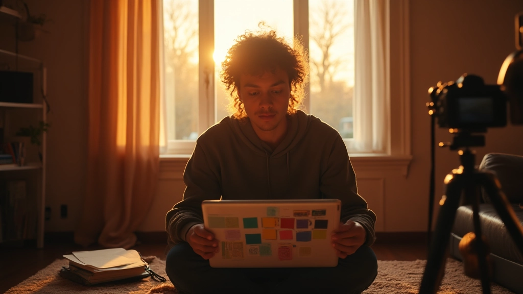
On a cramped apartment floor, a musician pins color swatches to a cork board, a notebook open to a storyboard, and a camera ready on a borrowed tripod. In that moment, the video identity begins not with a logo but with a point of view. This guide gives you a practical, narrative-driven approach to building a visual language for your indie music videos that supports your music rather than competing with it; you’ll follow a seven-step sprint that works with small budgets, real rooms, and the constraints of touring life.
Step 1: Frame your narrative contract
Visual identity starts with a promise. Before you pick a camera, decide what your video will say about the song and the artist. In practice, that means writing a short contract with three questions: What mood are we pursuing (bright and hopeful, gritty and intimate, moody and cinematic)? Which three adjectives describe the look and feel (for example: intimate, bold, and warm)? What does success look like on screen (a single, clear moment viewers remember)? Answering these questions forces you to choose a direction rather than chasing every possible trend. As you move from concept to frame-by-frame decisions, refer back to this contract to filter ideas that don’t fit. A quick exercise you can repeat later is to create three tiny mood boards—one for color, one for light, one for camera language—and ensure all three align with the contract. This alignment is the backbone of a visual identity that travels with you from a social teaser to a full-length video.
Exercise: write a one-paragraph narrative of your song as if it were a scene in a film. Then extract three concrete visual rules (color, lighting, camera movement) that would express that scene on screen.
Step 2: Build a mood board and palette with discipline
Indie budgets demand restraint. Begin with a mood board that anchors color, texture, and vibe. Pull imagery from existing project photos, album art, stage outfits, and landscapes that capture the emotional core of the track. From there, distill a simple 3-color palette plus one accent hue. A practical rule: choose one base color that appears in your wardrobe, one secondary color for lighting and environment, and one neutral (desaturated gray, brown, or cream) to ground scenes. The accent hue is your visual signature—use it sparingly to draw attention to a moment, a lyric cue, or an instrument. As you assemble, think about how the palette scales across locations: a rooftop at sunset, a basement rehearsal room, or a living room with a single window. The goal is coherence, not complexity. When the palette locks in, your wardrobe, set dressing, and graphics should echo those tones to create recognizability even in short clips.
Case in point: Nova, a bedroom producer, mapped the entire shoot to a warm amber palette with a sudden cobalt highlight for the chorus moment. The color shift was simple to reproduce on low-wattage LEDs but paid off visually and in social clips that feel like they belong to the same world.
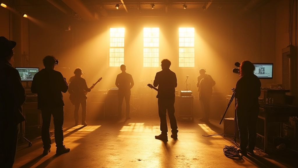
Step 3: Lock lighting and camera language in advance
Lighting is storytelling without words. You don’t need a full Gaffer team to get cinematic results; you need a plan. Start with a basic three-point setup for interiors: key light to shape the subject, fill to soften shadows, backlight to separate from the background. For dynamic moments, lean into practicals—table lamps, a streetlight through a window, a neon sign outside—that reinforce mood and color without breaking the budget. Plan your camera language to match the narrative contract: slow pushes for vulnerability, quick cuts for energy, wide establishing shots to reveal space, close-ups for emotion, and deliberate camera moves that mirror lyric changes. When you sketch your shot list, annotate each frame with the emotional beat and the palette cue it should carry. Also decide on a frame rate and shutter speed that feel intentional rather than generic; for indie projects, 24 fps with a 1/48 or 1/50s shutter typically offers a cinematic feel without heavy gear or post work.
Pro tip: test a lighting setup with one or two inexpensive LED panels and a bounce card. If you can see the furthest subject in the frame with good separation on the monitor, you’re in the right ballpark. If not, adjust the backlight or move the key light closer to the subject. The aim is to achieve clarity of expression and color fidelity in the first take, so the editing room becomes a place of refinement, not reconstruction.
Step 4: Design sets, wardrobe, and on-screen branding elements
Wardrobe and set dressing should whisper your identity rather than shout it. Start with a few anchor pieces—one standout item that becomes a motif, a consistent fabric texture (denim, corduroy, leather), and a small set of props that evoke your world (an old mic stand, a vintage poster, a familiar instrument case). The trick is repetition. If your chorus is a single moment of emotional release, repeat a visual cue at the start, middle, and end to bookend the journey. For branding within the video, keep on-screen graphics minimal: a logo watermark in a corner that never covers faces, a lyric cue in the same font as your other materials, and a lower-third that introduces the artist with the same color as the accent hue from Step 2. Remember, the visuals are the song’s framing device, not its substitute. A well-chosen wardrobe, a few carefully placed props, and a consistent background design turn a modest location into your signature space.
Three quick case notes show how this plays out. First, a pop singer used a single, textured curtain as the backdrop, a leather jacket, and a soft amber light to create an intimate live-room vibe. Second, a duo built a tiny “brand wall” using fabric swatches and a printed logo, which served as a flexible background that could be swapped in seconds between takes. Third, a solo artist with a tight budget used a local mural as a backdrop, integrated the mural colors into the lighting and wardrobe so the wall and subject fused visually in the frame.
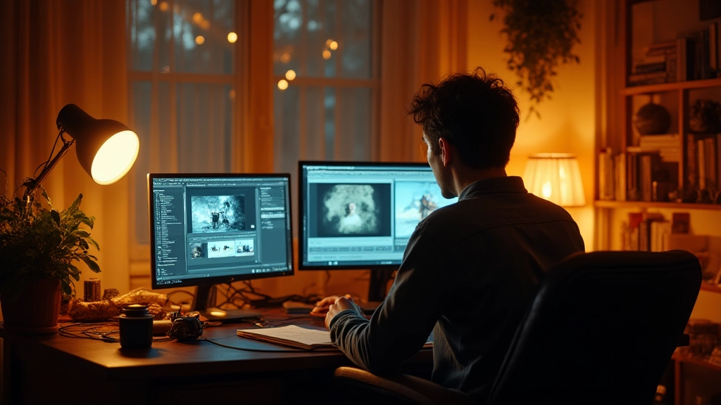
Step 5: Post-production voice and color grade with intention
In post, your voice is the glue that makes the visuals feel intentional. Build a simple, repeatable color grade recipe that reinforces your palette: preserve skin tones, lift the mid-tones to keep the performers expressive, and subtly push the shadows toward the mood color without crushing contrast. Create a short LUT (look-up table) or a preset that you can reuse across takes and future videos. If you are comfortable with editing software, a consistent rhythm in cuts—think three-second holds for verses, two-second cuts for the chorus, with a final payoff shot at the end—helps the audience ride the emotional arc even if the song structure is unconventional. In addition to color, consider how transitions carry your story: gentle crossfades for reflection, whip-pans for momentum, and match cuts that follow a character’s motion from one space to another. Small, deliberate effects—grain, mild vignetting, or a subtle glow around light sources—produce a cinematic impression without distracting from the performance.
AI tools can assist with mood boards, color suggestions, and even rough passes of visual effects, but the final grade should feel human and warm, not clinical. The goal is a cohesive look that supports the song and the performer, not a showcase of the latest gadgetry.
Step 6: Create accessible and social-friendly assets
Accessibility is a quality signal that expands your audience. Add captions and consider a simple signer-friendly version for the chorus if the artist works with a sign language performer. For social media, design a thumbnail that hints at the video’s mood and uses the palette and accent hue legibly. Keep text minimal, readable at small sizes, and aligned with your color story. Thumbnails often determine whether a viewer stops scrolling, so test two or three options that foreground emotion, weaponize the accent color, and include a cue that hints at the story—like a reaction shot or a striking gesture. The same branding elements should appear in your description, comments, and pinned posts so your videos feel like part of a single, coherent world.
In this era, you can also use AI-assisted tools to draft captions and alt text that remain faithful to the content. Use these as a starting point, then refine for tone and accuracy. The result is a more inclusive, more discoverable video without increasing your workload to an impractical level.
Step 7: Test, iterate, and document outcomes
The sprint ends with reflection, not a victory lap. After editing, review three things: how clearly the visuals tell the story, how well the palette holds across locations, and how the audience responds in the first 48 hours. Document what worked and what didn’t, so your next video benefits from your growing bank of decisions. Keep a compact shooting diary, log lens choices, lighting setups, wardrobe notes, and color grades, and compare the results against your narrative contract. This archive becomes priceless as you scale from a bedroom shoot to a small-team production and, later, a more ambitious project.
Three field-tested mini-stories that illuminate the approach
The following vignettes are composites drawn from real-world outcomes shared by independent artists who built a visual identity that served the music rather than the hype.
A bedroom producer named Nova used a simple amber palette and a cobalt chorus highlight to unify a three-song video sequence. The result felt cohesive on a smartphone, a laptop, and a club screen, because every frame echoed the same mood and the same story beat.
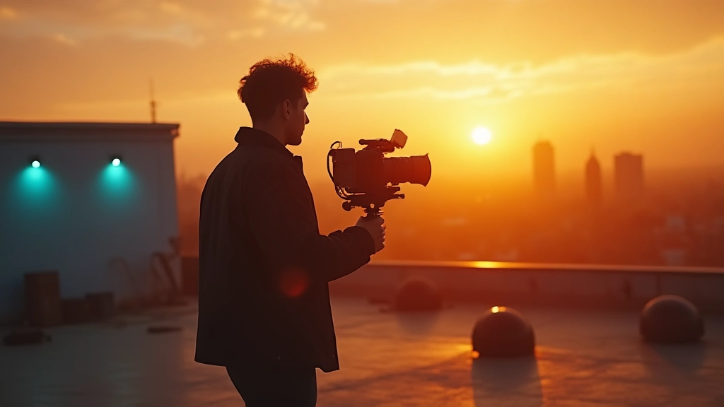
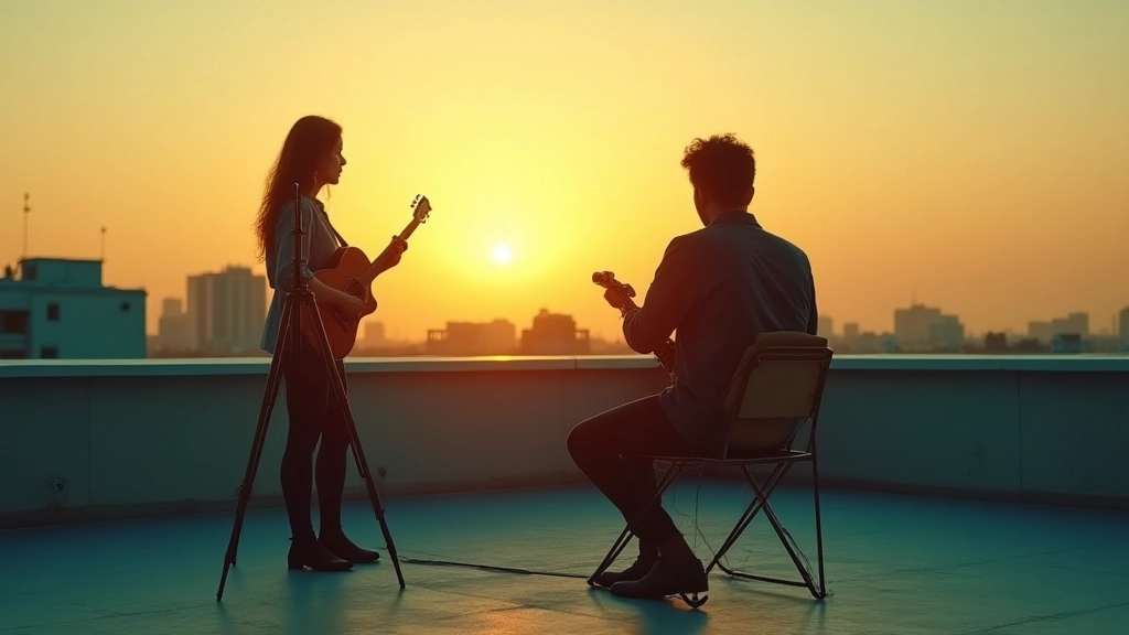
Vignette 2: The rooftop arc A solo artist with limited gear filmed a rooftop sequence at golden hour, emphasizing silhouettes and negative space. By prioritizing a clean three-color palette and a single accent hue for the chorus action, the video became instantly recognizable in a streaming feed. Viewers remembered the moment because the visuals paused on emotion rather than flashing tricks.
What looked like a small setup on a budget became a lighthouse in the feed: lighting that felt intentional, color choices that felt deliberate, and a performance that felt intimate yet cinematic.
Vignette 3: The street mural sync A duo collaborated with a local painter to create a backdrop that doubled as a color map. They aligned wardrobe, props, and lighting to the mural tones, which made every frame feel like a panel from a cohesive zine. The video traveled with the artist from a small club to a festival stage with no loss of identity.
When your visuals tell a consistent story, every new location feels like a chapter, not a reset.
Practical templates you can reuse today
To translate the ideas above into action, use the following ready-to-fill templates. They are designed to work in busy schedules, on modest budgets, and with diverse artists and genres.
- Visual Identity Sprint Brief: one page that captures narrative contract, mood, palette, and camera language.
- Color Pad: a three-color swatch with an accent hue and a note on where you will apply each color in wardrobe, set, and lighting.
- Shot List Template: 12–16 frames with emotional beats, camera moves, and lighting notes.
- Post-Production Recipe: color grade steps, LUT notes, and a short list of effects to apply consistently.
- Social Asset Kit: thumbnail, caption cues, and 15-second teaser version that share the same palette and mood.
Use these as living documents. Every video you shoot should feed back into the sprint, and every iteration should sharpen the identity you want fans to recognize in an instant.
The simplest visuals, when aligned with a strong story, become the most enduring brand signals for an artist.
Why AI is a helpful co-pilot, not a replacement
Artificial intelligence can accelerate the ideation and polish of your visuals, but the artistry remains human. Use AI to assemble mood boards, generate color-grade suggestions, or draft caption options, then apply your taste, context, and lived experience to refine the output. For indie artists, this partnership can save time and keep the project moving when resources are thin. The real value lies in letting AI handle repetitive tasks while you stay close to the emotional core of your music. When used thoughtfully, AI tools become a creative amplifier that complements your voice rather than a substitute for it.
Common pitfalls and how to avoid them
One big trap is chasing complex gear or trendy looks at the expense of storytelling. Your identity should support the song, not outshine it. Another risk is inconsistency across locations, which can fragment the narrative. To mitigate this, keep your palette and lighting language tight, and use the same framing motifs across shoots. Finally, avoid over-editing. A clean cut, a purposeful color grade, and a single, consistent accent will often outperform heavy effects that distract from performance. If you are uncertain, run a quick on-set review with a trusted collaborator: show them the mood board, the palette, and the shot list, and ask them to confirm that every frame feels like a chapter in the same book.
Bring it all together: a final sprint checklist
To finish strong, print or export this mini-checklist and run through it before you shoot. It should take you about 45 minutes to complete in advance, plus time on set for practical execution.
- Confirm narrative contract and three adjectives that describe the video personality.
- Lock a 3-color palette plus an accent hue and ensure wardrobe and set dressing align.
- Plan lighting with a three-point setup and practicals; choose camera language that mirrors the song’s arc.
- Prepare a shot list of 12–16 frames with emotional beats and transitions.
- Assemble a minimalist branding package: watermark, font, and thumbnail approach.
- Create a post-production recipe and a quick LUT to unify looks across takes.
- Test and document outcomes; capture lessons for the next video.
With these steps in your pocket, you can tackle any location, any budget, and any genre. Your visuals will become a natural extension of the music, offering fans a memorable doorway into your world without requiring a production army or a bank loan.
In practice, the most powerful visuals often emerge from restraint: a single palette, a handful of purposeful shots, and a narrative that fans can feel in their bones. When you treat your video as a musical moment rather than a product, the branding grows organically and becomes something fans want to share. This is the core of a true visual identity for indie music videos: not a set of tricks, but a story that you and your audience keep revisiting, frame after frame, chorus after chorus.
As you close this guide, take a breath and recall the rooftop, the living room, the basements and sidewalks where your music lives. You have a voice, you have a method, and you have the spark of a visual language that can travel with you across stages, screens, and social feeds. Start this week with Step 1, and let the seven-step sprint unfold in your own studio, your own city, and your own daily routine. Your music deserves visuals that are as honest as the sound you make, and your audience deserves to experience them with clarity, emotion, and curiosity.
And if you want a quick sanity check before you press record, here are the two questions you can ask yourself at the end of each shoot day: 1) Does every frame feel like it belongs to the same story, or did we drift into a random aesthetic? 2) If a friend watched the footage in black and white, would they still feel the musical moment we intended? Answering these simply can keep your identity coherent and alive as you grow as an artist.
Hear what these choices do to your own song.
Upload stems or a finished track, choose a reference direction, and compare a private Moozix mix before you export anything.